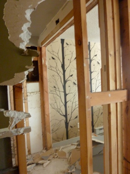
February 22nd, 2011. My year-old Cavern Blackbird wallpaper got torn down as the downstairs remodel officially got underway…
So I guess installing it was a little premature. But how was I to know David would decide to insulate the wall? Erf.
My plan all along has been to replace it with the same wallpaper. I liked that it was screened onto actual kraft paper. Nice texture and a strong graphic. Plus I really wanted to bring a little of the outside into that dark space. But it turns out they’ve changed the paper. I do not like the sample. Blech.
Rethinking is necessary.
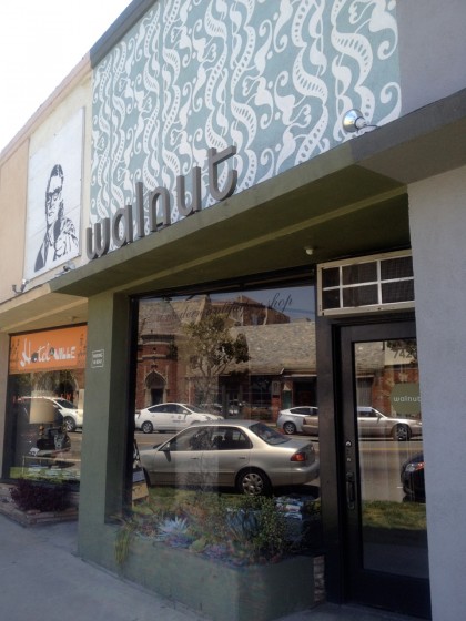
While in L.A., I dropped by Walnut Wallpaper (across the street from Heath Ceramics, yum)…
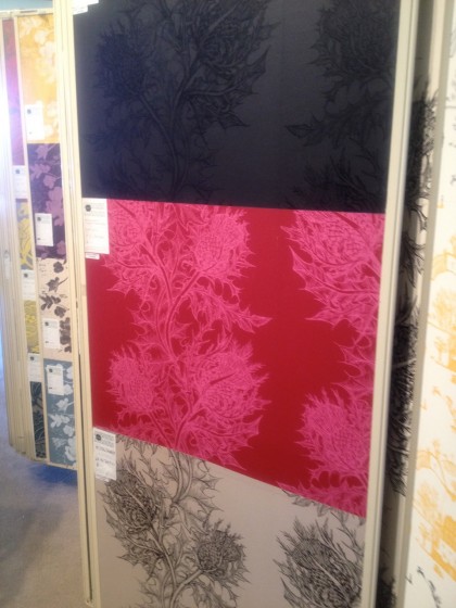
I’ve stalked their site for years, so I had a good idea of what was inside. Rack after rack of oohs and aahs…
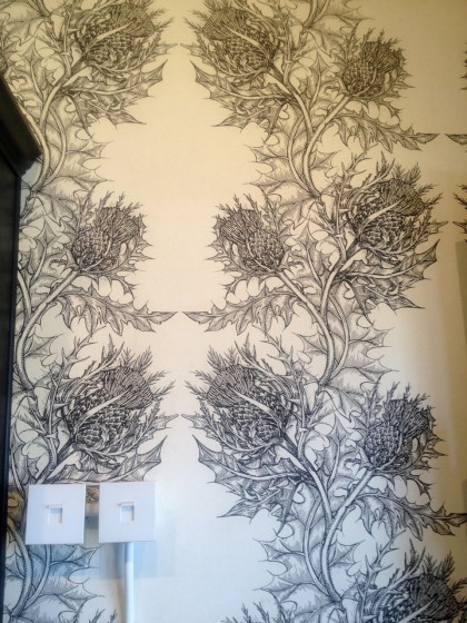
I was seriously tempted by that black on black. But I decided the straight rows of mirror-image thistle that Walnut had on one of their own walls felt a little too formal. What gorgeous illustration, though…
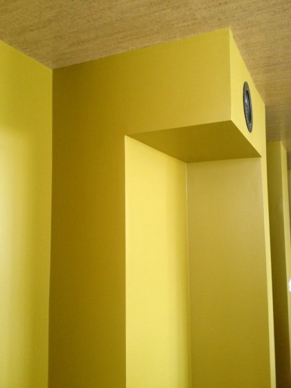
Back in Providence, I ordered scads of wallpaper samples to hold up to our crazy new Mustard Olive paint — which is looking particularly bright in the light here…
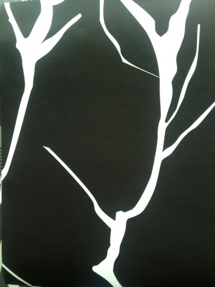
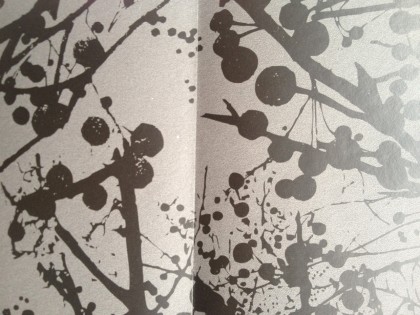
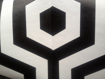
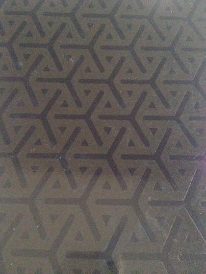
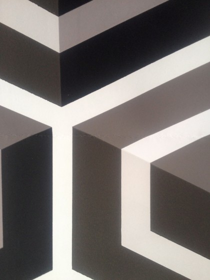
Below are shots of my wallpaper samples (rollover images for name) — believe me, I know, wallpaper is such a personal thing. You may hate all of these but these are the ones I thought might work. Unfortunately, my multiple personalities are showing and I can’t decide which one wins.
One last thing: this room is the fun room. Movies will be watched here. Games will be played here. Records will be listened to here. The wet bar will get much use. And upon occasion, guests will sleep here. I’d like to think of it as a really awesome boutique hotel room with a 7-year-old on the couch.
Oh, and for better images of these and more, pop up my Pinterest wallpaper page.
NATURE
Disclaimer on the first two wallpapers: I couldn’t capture the true black of the paper. They read a lot darker in person and look pretty great. My Pinterest link has more realistic images.
GEOMETRIC
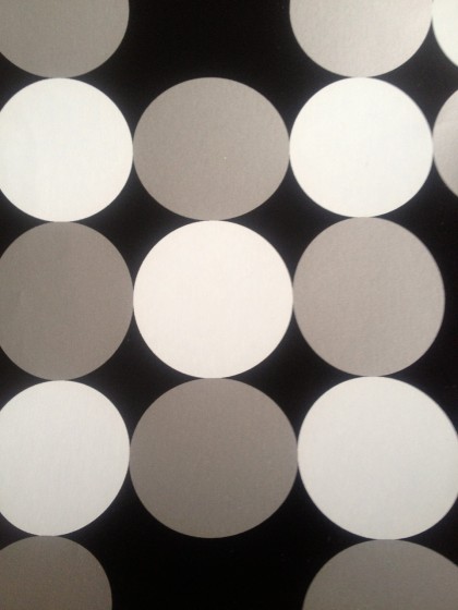
Wallpaper + math = love.
This one may be overkill but I couldn’t resist sending your brain into spasms. (Be sure to see the larger image via Pinterest.)
FUN
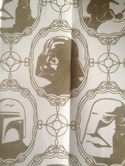
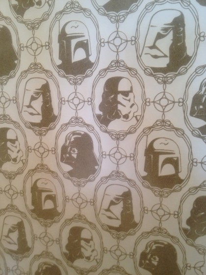
Because I am a geek, I confess that this may be my favorite of the bunch…
No, really! Imperial Forces, launched at the end of last year. Here’s a larger sheet at Walnut. Go ahead, gawk…
Did I mention it’s flocked? Flocked! The TV is going to be on top of whatever paper we choose, so this might be a fitting choice.
However, I have not decided. A black wall would look fabulous, certainly, but is it too serious? David says geometrics will be distracting — like anyone’s going to look past the television, right. Is Star Wars too fun? I just can’t decide and I need to order paper right away. Tell me what you think.
Tags: 70s, paint and stain, remodel, wallcolor, wallpaper
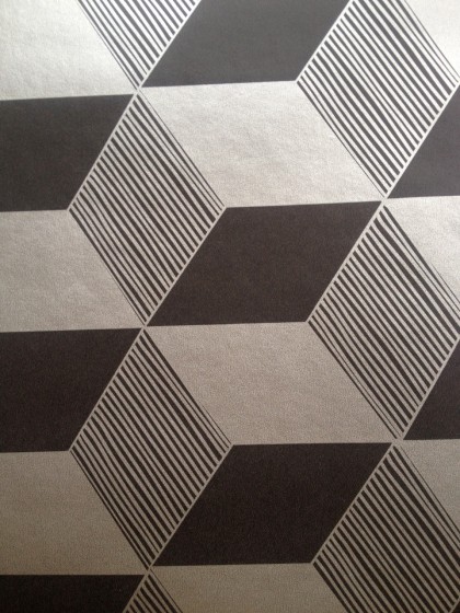
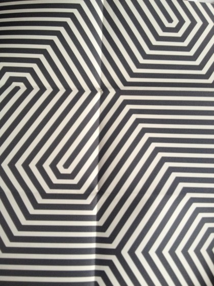
OK, you asked. I like the first 2 best. And of the two, I prefer the lighter one. Too bad the previous paper isn’t available anyone – it was so cool.
Wendy votes for nature! we’re getting closer to a winner.
scale???? we need a reference. otherwise too hard to tell what we’re looking at. for example, the geometrics might give you a headache depending on the size of the shapes…
my first instinct is the first one. black and white is very neutral to go with any wall color, but not as seizure causing as the geo stuff. it references your original nature pattern, and is simple but decorative, and has some visual ‘resting’ places – it is not too busy which may be too overwhelming when you cover a whole wall with it (is it one wall or more?).
the second one looks like a jackson pollock rip-off. not very original.
the 6th one could possibly work since the pattern is more subtle and looks like it may have gold/green that would go with the wall color, but i’d need to see it against your paint, and again want to see the scale.
lastly, and alternatively, hire josie to paint a new cavern blackbird pattern directly on the wall! $$$
Jen, check my Pinterest page for images that show scale. http://pinterest.com/ubettahrunhonky/remod-modern-wallwear/
Also, there are a few more choices in there. :)
I thought for sure you’d choose the Thistle!
well….not *all* the samples have scale on pinterest either ; )
still curious about #6. am realizing now that i look at pinterest for the 4th time and actually see the sample there this time, that the color i see in it is actually a reflection OF your wall paint color. that could work!
this http://pinterest.com/pin/259449628503650743/ is similar to your #1. i like both.
also, does this come in any other color combos that might work? this is you. http://pinterest.com/pin/259449628503049799/
i *love* the thistle but not for you. wouldn’t make sense for what i would guess the furniture and other things would look like.
as you can see on the Pinterest page, #6 (Vapor) is kind of a matte finish over the top of gloss, black on black. very subtle but BAM when you catch the pattern in the light.
Do the Stretch only comes in mustard right now. too bad. it’s a nice pattern.
Thistle is a little too grand and maybe a bit Victorian. just loved it in black on black. i’m obviously having a moment with black on black. ;-)
These are nice choices. I personally have been coveting the thistle wallpaper. Have you looked at Elitis wallpaper? Their textures are amazing, and maybe a little more timeless. http://www.elitis.fr/en/papiers-peints/
The glass dolce vita one looks like it could be of a similar feel to what you had before (in person it looks like 1/4″ glass mosaic pieces).
I think the geometric options could overwhelm the room.
ooh, haven’t seen the Elitis offerings before. thanks for that, Nora! you’re right, the textures are super cool. love the Madagascar and the Textures Vegétales. beautiful!
Well, we made our wallpaper decision and it’s being installed next week. All shall be revealed soon!
[…] first: the wallpaper is […]