Posts Tagged ‘remodel’

this just in!

Monday, March 5th, 2012

Not only are David and Joe outside putting up siding, but there are two other crews working inside. That makes this the biggest remodel population our house has seen yet!

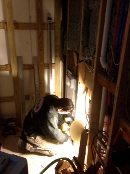
The plumber is here working in the dark…

plumber


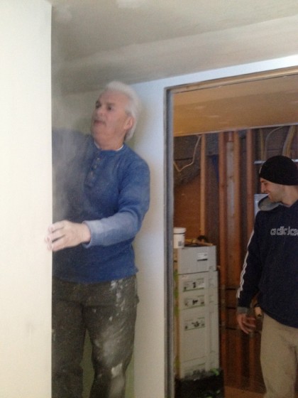
His partner in crime is on the right, happily breathing the dust being made by the guy on the left…

partner in crime


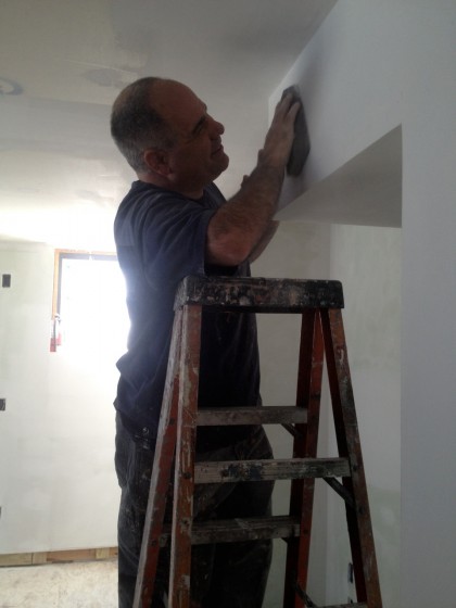
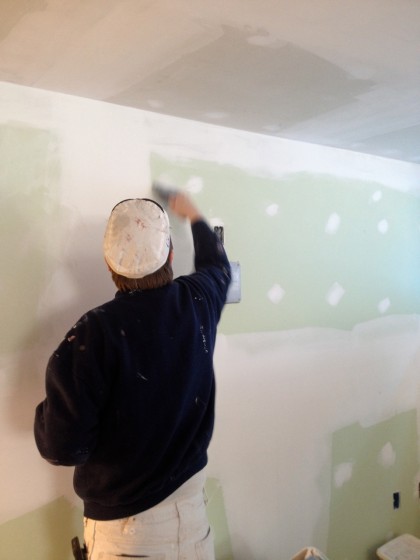
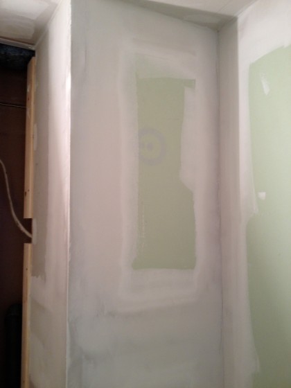
Yep, the paint crew is here to prep the walls for painting…

wall prep


more wall prep


I can’t believe they’re not stumbling over each other down there. Go, team, fight!

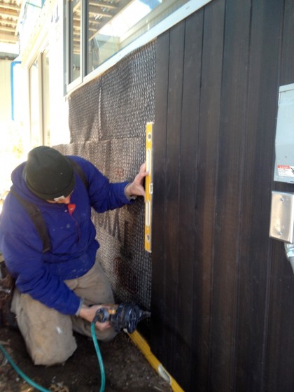
exciting siding

Monday, March 5th, 2012

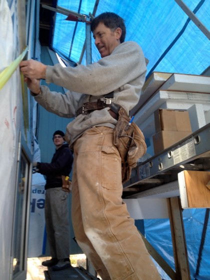
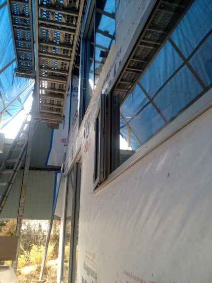
The boys are out in the freezing cold today nailing up the siding…

joe nails up the siding


Details later. Thanks, Joe!

color, redux

Saturday, March 3rd, 2012

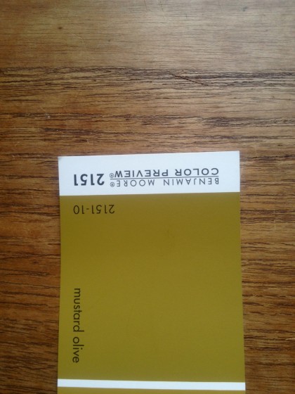
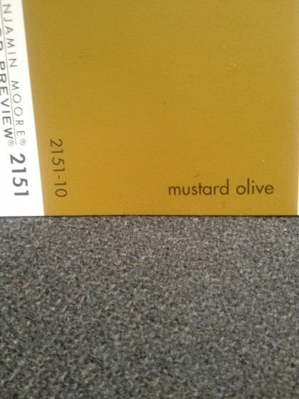
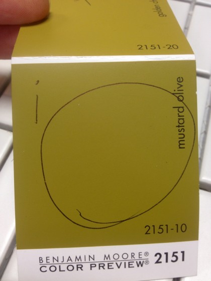
So I showed you colors for downstairs yesterday. What I didn’t mention is that I’ve been obsessing over this Mustard Olive shade for a few years. Something about it resonates with me right now….

benjamin moore mustard olive


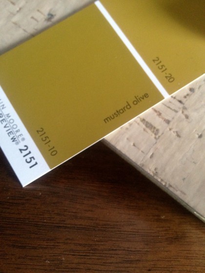
Most of the time it looks olive, as above. In the sun, it tends more toward mustard…

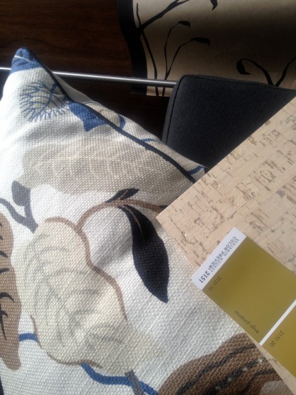
mustard olive by benjamin moore against my couch fabric


Either way. I dig it. The downstairs won’t get much, if any, direct light, so the paint should read as olive.

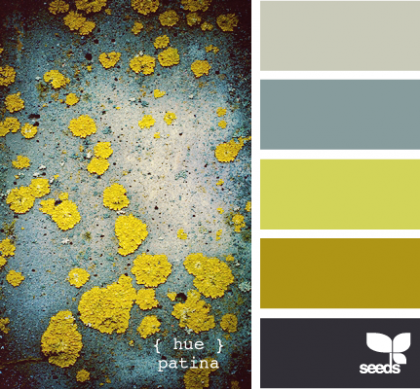
I’ve been stockpiling images I as color inspiration for a few years and I noticed I’ve bookmarked this color A LOT — like this image that’s been sitting on my desktop since last summer. There’s the color, fourth color chip down…

hue patina | design-seeds.com

hue patina | design-seeds.com


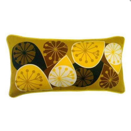
And this:

seville cushion by michelle mason | notonthehighstreet.com

seville cushion by michelle mason | notonthehighstreet.com


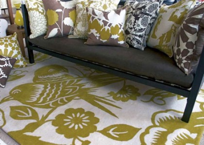
And this:

hand-tufted lovebirds rug by thomas paul | outblush.com

hand-tufted lovebirds rug by thomas paul | outblush.com


See how great it looks with bluish grey and white and dark brown on the far right there

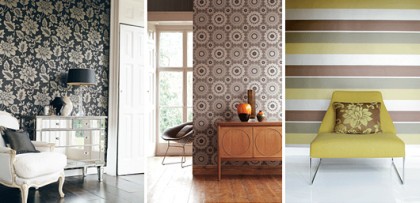
midbec striped wallpaper | trendenser.se

midbec striped wallpaper | trendenser.se


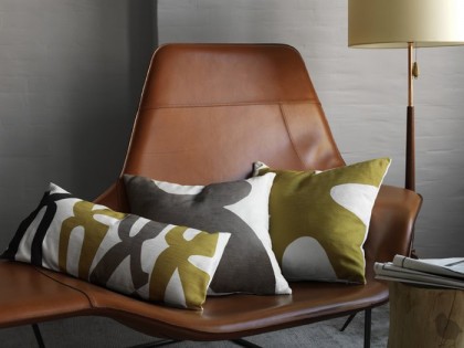
Love these linen pillows — these are from a few years ago, so don’t bother to hunt for them…

dwell studio paloma pillow in saffron | absolutematerialist.com

dwell studio paloma pillow in saffron | absolutematerialist.com


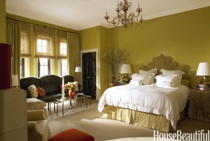
This color has been popping up more recently in House Beautiful’s Green Issue, March ’12. How about this bedroom?

chicago townhouse bedroom by alessandra-branca | housebeautiful.com

chicago townhouse bedroom by alessandra-branca | housebeautiful.com


Not my style, but I lurve the color!

color for downstairs

Friday, March 2nd, 2012

It’s taken a few days to switch over, but I have now made the full switch from Mountain Time…

back from colorado


… to Remodel Time:

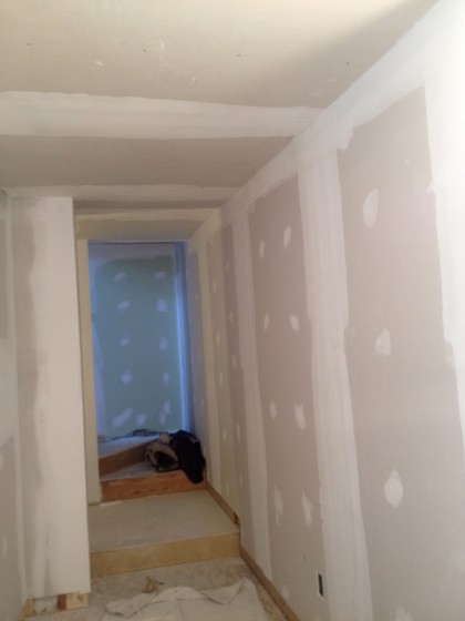
walls finally plastered


Yep, we got plastered. Completely plastered. And now it’s time for the cherry on top: paint!

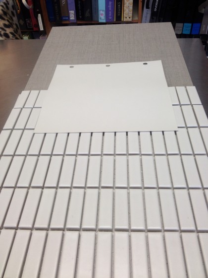
First, the bathroom. We carried the tiles over to Benjamin Moore and matched up a white to coordinate…

paint to match the tile


As you can see, the white tile isn’t a crisp white, it has a lot of grey in it. So we opted for a white with soft grey undertones: Classic Grey in Natura Zero VOC, Eggshell Finish. On top is Ann Sacks Texere in Dove, 12″ x 24″ plank tiles — for the floor. On bottom is Ann Sacks Savoy Stacked Brick Mosaic in Chalk, 5/8″ x 1-7/8″ — for the walls.

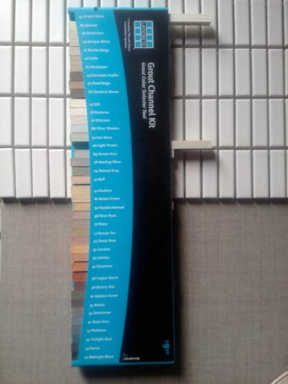
Had to choose grout for the tile too…

choosing grout for the tile


The only other real “color” in the bathroom will be the walnut built-ins. Spa-like but modern and spare.

Unlike the upstairs which is really all about the view, the downstairs is darker, with fewer windows. Because this will be the cushy, flop-on-the-couch entertainment area, I want it to accentuate the coziness, so white didn’t make sense.

I also want to bring some of the outside in so that it’s not so starkly different from the upstairs. Therefore, natural, neutral colors. This is what will go on the walls…

benjamin moore mustard olive


I know, I know, Mustard Olive looks like an “off” color, doesn’t it? But because it’s a shade of green with a lot of gold in it, it’s warm without being too dark. There’s not a whole lot of natural light down there, so it won’t read as bright most of the day.

It will look good next to our dark walnut built-ins and the cork that will be on the floors and ceiling (we kept that pale to bounce more light around)…

paint and cork and walnut


You’re still not convinced? I could tell. Here it is against more stuff. I like how it looks with grey…

paint against more stuff


That’s Cavern Blackbird wallpaper in Kraft (yes, same paper I put up before), the charcoal wool of our Libre sectional, and one of the pillows we like to plump up while watching AdventureTime.

Don’t worry, when it’s all said and done it will look great. Or else.


okay, vacation’s over

Wednesday, February 29th, 2012

Back to work!

david and joe at work


So David and Joe have been getting the un-sided end of the house ready to close up while the plasterers finish up downstairs. David can update us on the proceedings thus far.

——————————————————————————————-

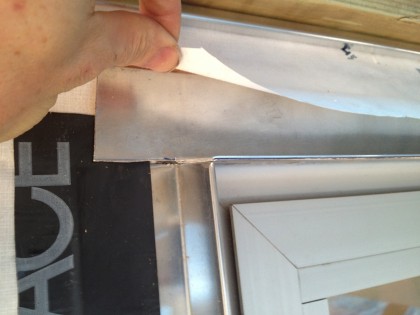
Now that the siding is all stained and had a chance to dry, we can get ready to install it. First up: flashing the sides and tops of the door and window openings.

Here, a side piece was carefully mitered onto the existing sill flashing that went in when the window was installed…

window flashing with mitre


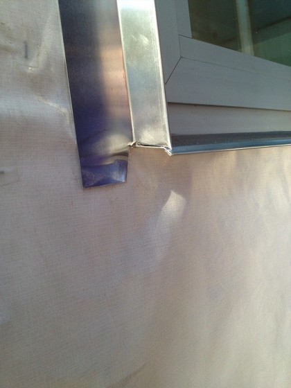
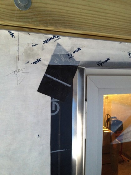
Next, the side flashing got nailed to the house and then taped to the house wrap. The joint between it and the sill flashing, as well as the joint between it and the window frame, will be caulked with the same low-VOC grey caulk we used between the windows and the house…

next step on the flashing


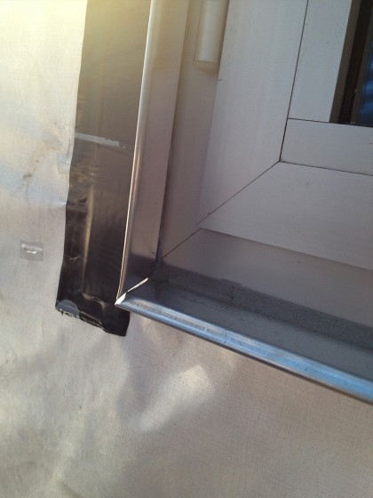
The top flashing rests on the two side pieces of flashing and was also mitered. It extends up through a slit in the house wrap and was nailed in place…

yet more flashing detail


The corner junction of the top and side flashings was taped and then the house wrap taped down to the top flashing. The goal is to shed water out as it goes down, never allowing it entry to the house.

That piece of pressure-treated wood with the big bolt in it and the nice piece of flashing under make up the the deck ledger…

hoping to shed water


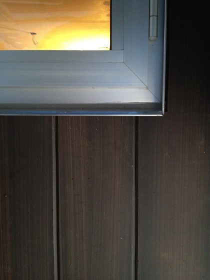
The ledger board had to go in before the siding, but that story deserves a post all its own. Here’s a sneak peek of the newly stained siding installed around the big downstairs window…

newly stained siding and window flashing


Hot. Love how clean it looks — no more clunky trim! Don’t worry, the blue strip above the siding is just the blue of the overhead tarp captured in the shiny new flashing.

the dust is flying

Thursday, February 16th, 2012

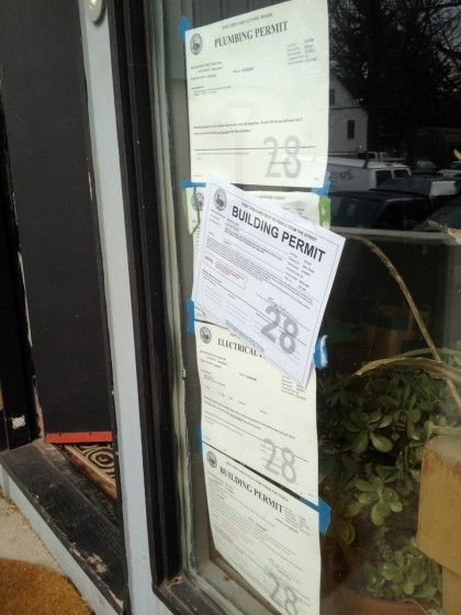
Literally. Flying. Before I go any further, let me note that February 1 was the one-year anniversary of the permit that gave us the green light on our remodel…

permitpermitpermitpermit


We’re running out of window space.

So, about the dust. Two crews working today. David and Joe are prepping for the install of the deck ledger board

david and joe prepping for the deck ledger board


That should be done sometime after lunch and perhaps the siding will start to go up? Drilling holes through the insulation and into the wood behind it is definitely dusty.

Now that the walls are closed up downstairs, a plastering crew is busy making them look absolutely impeccable. Installing corner bead, taping, lathering on the drywall compound…

prepping the walls


Oh, and sanding. Dusty.

More on the progress of both crews later.

transformation under way

Wednesday, February 15th, 2012

No wasting time here. Now that a color decision is made, the deck-end of the house where the siding was removed can finally get closed up and the tarp can come down…

deck end of the house awaits siding


As mentioned, the redwood that was on this inset was removed so the new windows and slider could get installed. Eventually, that painted redwood will be planed clean and added to the outer envelope of the house — later in the year.

The new cedar for the deck-end inset…

cedar siding before


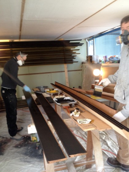
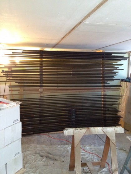
… got a healthy coat of stain yesterday, front and back, by David and Joe.

staining the siding


It’s winter — too cold outside for the stain to dry. So the stain had to be applied indoors. The vapors were wicked awful, even with respirators on and all the windows and doors open…

siding on the drying rack


After a night of airing out on the drying rack David whipped up, the siding should be dry now. The stench isn’t so bad today.

Next up: the new siding goes on the house. Then we get to live with a temporarily odd sage-green and grayish black color combo until the rest of the siding gets tackled. Yay!

is there a hi-fi way?

Wednesday, February 15th, 2012

… as opposed to my remedial colored-pencil approach to trying different colors on the exterior of our house? Of course there are other ways. There are a number of software choices out there, but not all of them are good and they’re not all designed for the basic homeowner.

The one that seemed to have the best reviews was Benjamin Moore’s Personal Color Viewer (PCV3), available for Mac or PC….


At $10, it seemed like something worth trying, so I did. It’s Adobe-based software so it’s not particularly stupid-proof if you’re new to Adobe. Out of curiosity, I tried it out a couple of different ways.

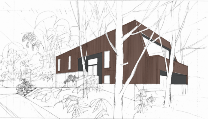
First, I uploaded an architectural rendering and played with that…

Benjamin Moore Personal Color Viewer: using an architectural rendering


Hard to tell what’s going on by looking at a rendering, it turns out.

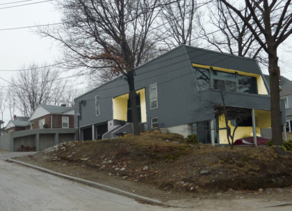
So then I uploaded a photo and played with that, too. Here’s one somewhat sloppy example…

Benjamin Moore Personal Color Viewer: using a photo


The software comes loaded with BM’s color palettes, but it’s laborious to experiment with colors — I tried to find the right gold-green but it literally takes FOREVER to change what you’ve done. The navigation is horrendous. I say this as someone who’s in the business of helping to make things online more user friendly.

I do like being able to see what colors on the exterior look like in the context of the houses around ours. But overall, I think my results were hardly worth the time I had to spend trying to compare different shades on the areas I masked out.

Bottom line on the Personal Color Viewer: If you have hours and hours to waste, go for it.

If you’re in a hurry, whip out the colored pencils.

drumroll plz… the color choices

Tuesday, February 14th, 2012

Well, the day is here — the day we commit to colors. Here’s how it went down.

David decided that once he finishes adding insulation to the outside of the house there won’t be enough of our existing redwood to go around the enlarged envelope, so he ordered cedar. How will we deal with the natural color differences in two kinds of wood on a single house? Easy. The existing redwood will get pulled from all the inset areas and get used on the main envelope. The new cedar will go on the insets.

And how will that look? Well, I went back to my initial color exploration and got out the colored pencils.

How lo-fi.

And approximate.

Some of you liked the bold color approach, so I tried this… Grey on the outside and a plant-inspired gold-green on the inside. Would take some courage but I kinda dig it…
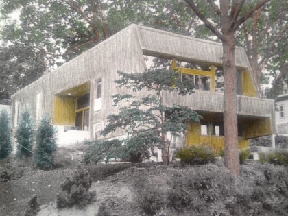
grey and color


Not a neon green but a green with a Dijon-y tone to it. Along these lines…
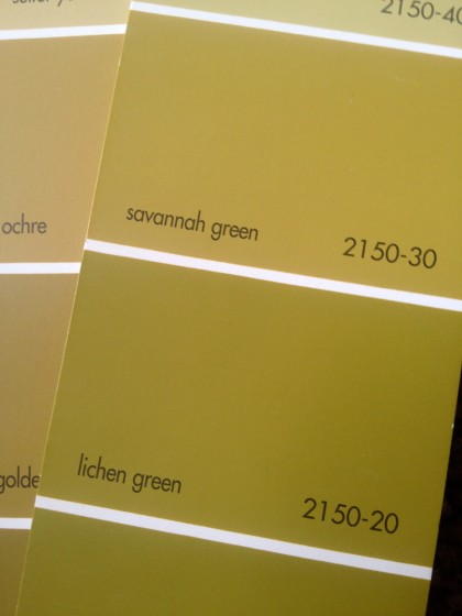
goldy green paint swatches


Grey on the outside and brown (natural wood color) on the inside. Safer but not loving it…
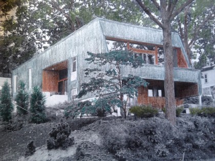
grey and brown


I always pictured the house as grey, but another option was brown (natural wood color) on the outside and dark, dark grey on the inside. I liked this better…
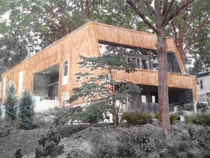
brown and grey


Bix, of course, lobbied for his choice…
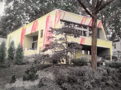
yellow and red candy-striped


At this point we thought we might want to see the grain of the redwood through whatever shade we chose for the main body. So David planed the paint off a few of the boards that were removed from the deck-end of the house to see what shape the wood is in…

paint removal


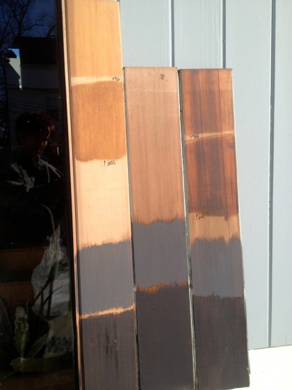
Then off we went to Adler’s paint department with 40-year-old redwood and new cedar in hand to try out stains. Here’s what the first color tests looked like…
color tests on redwood and cedar


New cedar on the left. Original redwood on the right. The dark grey at the bottom is too dark for the exterior. We don’t want to live in a black box. The lighter grey is okay. But how about the way that clear stain really brings out the richness and character of the redwood? Why hide that?

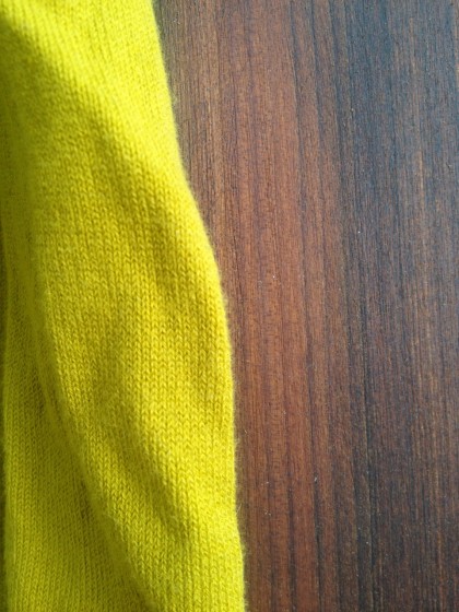
Sidetrack… Just for yucks I tried the gold-green against the wood color to see if that might still work for the insets…
wood and gold green


Okay, my sweater’s way too bright in the sun but you get the idea. David, however, was not convinced. So gold-green was eliminated. (I’ll be resurrecting some version of it as an interior paint color.)

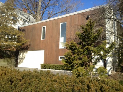
There’s a modern house on my running route that’s a decent example of a real wood-look exterior…
another modern in providence


Don’t love the off-white as a contrast choice for us but what about dark, steely grey or even black? It’s a little more dramatic without being show-offy…
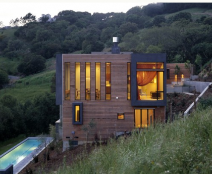
Walden Residence by House + House Architects | houzz.com http://bit.ly/wLom0q

Walden Residence by House + House Architects | houzz.com http://bit.ly/wLom0q


Once you add grey/black, white works nicely (perhaps for our foundation if we can’t figure out how to take it back to its original concrete-grey)…
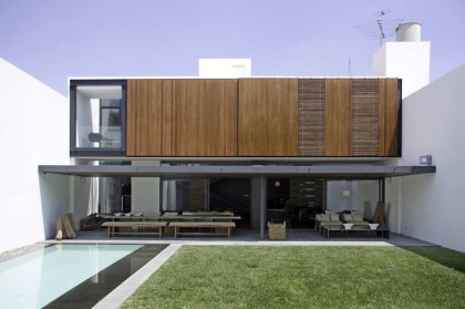
Casa Ro by Elias Rizo Arquitectos | archdaily.com http://bit.ly/yMXFse

Casa Ro by Elias Rizo Arquitectos | archdaily.com http://bit.ly/yMXFse


So I guess that’s it then.

On the main body, glorious redwood — stained clear to show its awesomeness.

A dark, almost black stain on the insets.

And white at the base assuming (and it’s a pretty good assumption) that we can’t bring it back to a bare concrete state.
 

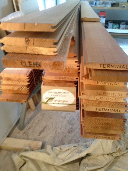
up to our knees in cedar

Tuesday, February 7th, 2012

Liberty Cedar arrived today and dropped a load…

delivery from liberty cedar


… of cedar.

This means that siding the still tarped-over deck-end of the house is imminent. Which also means we need a final decision on exterior color. Like now. Argh.